Awesome work, really all i needed!
One wish:
possibility to show the sidelist under or above the search results in the browers, just like in VDJ7 standard theme.
One little thing to fix:
i can's see the limiter.

One more wish: look at the scratch waveform, it's just an idea, i don't know if its technical possible.
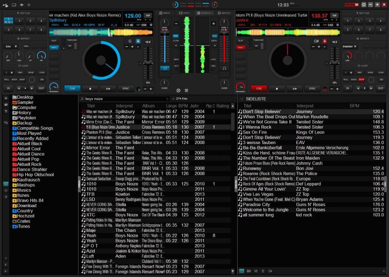
One wish:
possibility to show the sidelist under or above the search results in the browers, just like in VDJ7 standard theme.
One little thing to fix:
i can's see the limiter.

One more wish: look at the scratch waveform, it's just an idea, i don't know if its technical possible.

Posted Wed 05 Nov 14 @ 6:07 am
Every gain knob has a light that shows related deck limiter.
Every master volume knob has a light that shows master limiter.
Those lights are to be enabled in :
- mixer menu / monitor / compressor
Also The master vu-meter in the topbar can show master limiter (look at the peaks, they become longer when limiter kicks in).
You may click on this master vu-meter to show a menu to enable/disable various things, including limiter.
You can bring the old style sidelist by triggering the VDJ option showHorizontalSideList to on (in "browser" category).
Posted Wed 05 Nov 14 @ 6:27 am
Thanks for your fast reply!
The horizontal sidelist is now activated again, which is great.
I've tried to make the the vu-meter in the topbar visible but it doesn't work.
i can only see the Clock with the CPU-meter at its right.
I think the vu-meter should be visible between the CPU-meter and the vdj logo, but there is nothing visual for me.
Edit: the master Volume is only shown when the master-signal is set to a specific output. Normally i work with separated outputs for channel 1-4
Posted Wed 05 Nov 14 @ 6:58 am
You're right, I will try to add another visual in the case the master vu would be not shown.
Thx :)
Thx :)
Posted Wed 05 Nov 14 @ 8:17 am
Hey Fruit looks good.. Does your skin have browser view?
Posted Mon 01 Dec 14 @ 3:41 am
Of course, it even has 2 different big browser layouts.
They both handle single/double height waveforms.
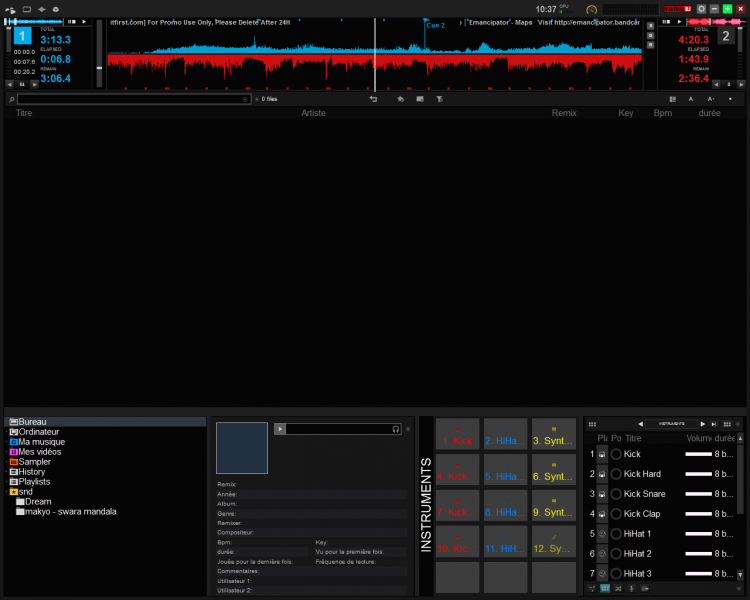
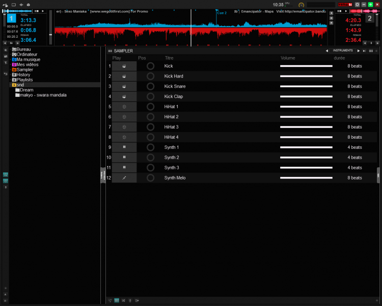
They both handle single/double height waveforms.


Posted Tue 02 Dec 14 @ 4:00 am
great amazing skin: found some bugs-errors /// and some suggestions /// questions
* in 4 deck swap mode: - main waveform (default mode): when you selecte the wave in the main big waveform screen (not the deck waveforms) you can only select the left blue one, even when you select right deck / deck 2 etc. you cannot select the red wave, it will always select the blue wave. in 2 decks mode this works fine. this is inconvenient if you want to set the right deck for cueing on a touch screen etc.
* filter knobs dont show in 4 deck swap mode, it only shows the gain. would be great if you could alternate between gain and filter knobs
suggestion 1:
I have always played the standard 4 deck skins so I kinda miss the green and yellow/orange colour to distinguish decks 3 and 4. Is there a way to implement this identification in the main wave, bpm colour and select deck 1,2,3,4 etc. ?
suggestion 2: the swapping still kinda confuses me. Is it possible to not swap the entire deck, but keep the relative position the same: 1,2 top left and right and 3,4, bottom left and right.. and the only thing that changes could be extending the deck when you select it: i.e. 1 selected (remains top position) extended view, 3 selected (remains bottom position, but now has extended view etc. ?? or maybe as an option ?
suggestion 3: : maybe another view where all decks are shown with pitch fader and no swapping occurs? or as an option?
regarding loop extended view: the small squares have to be pressed now. it would be great (for i.e. touchscreen use to be able to slide over from left to right and immediatly have the loop length change accordingly for amazing effects. Now you have to press and press again to select another one. Would be great if you could just slide over the squares while holding mouse or touchscreen and that it would immediately change the loop length!
question:: can you make browsercolumns lockable?
question:: can you make folder pane lockable?
question:: can you make browser panels lockable like in version 7?
question:: how can I map the alternate browser view mode? (mouse right click mode)
These are just suggestions and questions to improve. I really really love your skin and plan to use it. cheers!
Posted Tue 02 Dec 14 @ 8:57 am
Timm United wrote :
These are just suggestions and questions to improve. I really really love your skin and plan to use it. cheers!
Glad to read that ^^ THX
Timm United wrote :
suggestions 1 & 3
The standard 4 decks layout (that you can see in the archive with the name "z 4 decks") will be seemlessly implemented in the common layout in a near future so you will be able to quickly switch from 2 decks, to 4 decks, to 4 decks swap.
Timm United wrote :
suggestion 2: the swapping still kinda confuses me. Is it possible to not swap the entire deck, but keep the relative position the same: 1,2 top left and right and 3,4, bottom left and right.. and the only thing that changes could be extending the deck when you select it: i.e. 1 selected (remains top position) extended view, 3 selected (remains bottom position, but now has extended view etc. ?? or maybe as an option ?
Based on my answer to suggestions 1 & 3 I'm an unsure this would be needed but I keep this idea in mind, I'll try it a bit. But no promise of an eventual implementation.
Timm United wrote :
* in 4 deck swap mode: - main waveform (default mode): when you selecte the wave in the main big waveform screen (not the deck waveforms) you can only select the left blue one, even when you select right deck / deck 2 etc. you cannot select the red wave, it will always select the blue wave. in 2 decks mode this works fine. this is inconvenient if you want to set the right deck for cueing on a touch screen etc.
Not sure I understand this... If you're talking about dragging the red wave, of course you still can do it, holding the right mouse button. The behavior is slightly different but there's nothing you can't do.
Timm United wrote :
* filter knobs dont show in 4 deck swap mode, it only shows the gain. would be great if you could alternate between gain and filter knobs
Yup this is a known bug, it will be addressed in next release.
You still can avoid this bug by :
- entering 2 decks mode
- in the 'mixer menu', choose anything but disabled in the 'sides' sub-menu
- entering 4 decks mode again
Timm United wrote :
question:: can you make browsercolumns lockable?
question:: can you make folder pane lockable?
question:: can you make browser panels lockable like in version 7?
question:: can you make folder pane lockable?
question:: can you make browser panels lockable like in version 7?
Not sure but I guess no, unless I do a straight custom view (like in the jukebox) with absolutely fixed panes... It would be far too heavy IMO. This should be up to the team to provide such features maybe you should suggest it in the appropriate forum.
Timm United wrote :
question:: how can I map the alternate browser view mode? (mouse right click mode)
You would map the action :
skin_panel 'withnodecks' toggle
Timm United wrote :
regarding loop extended view: the small squares have to be pressed now. it would be great (for i.e. touchscreen use to be able to slide over from left to right and immediatly have the loop length change accordingly for amazing effects. Now you have to press and press again to select another one. Would be great if you could just slide over the squares while holding mouse or touchscreen and that it would immediately change the loop length!
I didn't understand what you mean, could you be more specific please ?
Hope this helps,
Keep up the great mix !
Posted Tue 02 Dec 14 @ 4:12 pm
hey fruit thanks for your quick and elaborate response!
Timm United wrote :
suggestion 2: the swapping still kinda confuses me. Is it possible to not swap the entire deck, but keep the relative position the same: 1,2 top left and right and 3,4, bottom left and right.. and the only thing that changes could be extending the deck when you select it: i.e. 1 selected (remains top position) extended view, 3 selected (remains bottom position, but now has extended view etc. ?? or maybe as an option ?
Based on my answer to suggestions 1 & 3 I'm an unsure this would be needed but I keep this idea in mind, I'll try it a bit. But no promise of an eventual implementation.
I think this will prevent any possibility of disorientation ;-)
Timm United wrote :
* in 4 deck swap mode: - main waveform (default mode): when you selecte the wave in the main big waveform screen (not the deck waveforms) you can only select the left blue one, even when you select right deck / deck 2 etc. you cannot select the red wave, it will always select the blue wave. in 2 decks mode this works fine. this is inconvenient if you want to set the right deck for cueing on a touch screen etc.
Not sure I understand this... If you're talking about dragging the red wave, of course you still can do it, holding the right mouse button. The behavior is slightly different but there's nothing you can't do.
So what I meant was: (4 deck swap skin) selecting the red wave for manipulation (cueing etc.) is not possible now using a touch screen. Imho it would be better to follow selected deck (like in 2 deck skin) So if you select dec 1 (click the 1 number) you can manipulate blue wave and when you select deck 2 (click the 2 number) you can manipulate the red wave. Touchscreen doesnt really have right mouse + it is more the behaviour we are used to. I hope this clarifies what i mean ;-)
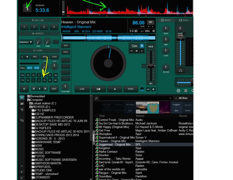
regarding loop extended view: the small squares have to be pressed now. it would be great (for i.e. touchscreen use to be able to slide over from left to right and immediatly have the loop length change accordingly for amazing effects. Now you have to press and press again to select another one. Would be great if you could just slide over the squares while holding mouse or touchscreen and that it would immediately change the loop length!
I didn't understand what you mean, could you be more specific please ?
By this I mean: the small squares for loop length (1,2,4,8,16 etc.) [picture] it would be great to be able to drag over them with a mouse or touchscreen and that the values would change. Now you cant drag over them, you have to press each button individually. This could create amazing looproll effects on the fly.
another question: Is your skin quite CPU heavy or is that just a wrong idea?
suggestion: If you will work on the 4 deck normal version, please make it customizable as well as your main skin and maybe an option to make the decks smaller i.e. with no jog wheel etc. just like your 2-4 decks swap extended view layout...
Thanks for looking at it. Just suggestions! really amazed by your skinning skills ;-)
Timm United wrote :
suggestion 2: the swapping still kinda confuses me. Is it possible to not swap the entire deck, but keep the relative position the same: 1,2 top left and right and 3,4, bottom left and right.. and the only thing that changes could be extending the deck when you select it: i.e. 1 selected (remains top position) extended view, 3 selected (remains bottom position, but now has extended view etc. ?? or maybe as an option ?
Based on my answer to suggestions 1 & 3 I'm an unsure this would be needed but I keep this idea in mind, I'll try it a bit. But no promise of an eventual implementation.
I think this will prevent any possibility of disorientation ;-)
Timm United wrote :
* in 4 deck swap mode: - main waveform (default mode): when you selecte the wave in the main big waveform screen (not the deck waveforms) you can only select the left blue one, even when you select right deck / deck 2 etc. you cannot select the red wave, it will always select the blue wave. in 2 decks mode this works fine. this is inconvenient if you want to set the right deck for cueing on a touch screen etc.
Not sure I understand this... If you're talking about dragging the red wave, of course you still can do it, holding the right mouse button. The behavior is slightly different but there's nothing you can't do.
So what I meant was: (4 deck swap skin) selecting the red wave for manipulation (cueing etc.) is not possible now using a touch screen. Imho it would be better to follow selected deck (like in 2 deck skin) So if you select dec 1 (click the 1 number) you can manipulate blue wave and when you select deck 2 (click the 2 number) you can manipulate the red wave. Touchscreen doesnt really have right mouse + it is more the behaviour we are used to. I hope this clarifies what i mean ;-)
regarding loop extended view: the small squares have to be pressed now. it would be great (for i.e. touchscreen use to be able to slide over from left to right and immediatly have the loop length change accordingly for amazing effects. Now you have to press and press again to select another one. Would be great if you could just slide over the squares while holding mouse or touchscreen and that it would immediately change the loop length!
I didn't understand what you mean, could you be more specific please ?
By this I mean: the small squares for loop length (1,2,4,8,16 etc.) [picture] it would be great to be able to drag over them with a mouse or touchscreen and that the values would change. Now you cant drag over them, you have to press each button individually. This could create amazing looproll effects on the fly.

another question: Is your skin quite CPU heavy or is that just a wrong idea?
suggestion: If you will work on the 4 deck normal version, please make it customizable as well as your main skin and maybe an option to make the decks smaller i.e. with no jog wheel etc. just like your 2-4 decks swap extended view layout...
Thanks for looking at it. Just suggestions! really amazed by your skinning skills ;-)
Posted Wed 03 Dec 14 @ 4:18 am
"Timm United" wrote :
Touchscreen doesnt really have right mouse + it is more the behaviour we are used to. I hope this clarifies what i mean ;-)
I see now, unfortunately I used a trick in the <rhythmzone> element to show only the waves of the main deck of each side. So if you switch from deck 1 to 3 for instance, the rhythmzone will select the wave to show accordingly. I can't really set this "mode" to my convenience, and I think I simply can't change the mouse behavior :(
I will try to add more waveview layouts in 4 decks / 4 decks swap modes. Maybe I'll do a layout that would behave normally (but with all 4 waves shown) especially for touchscreens.
"Timm United" wrote :
By this I mean: the small squares for loop length (1,2,4,8,16 etc.) [picture] it would be great to be able to drag over them with a mouse or touchscreen and that the values would change. Now you cant drag over them, you have to press each button individually. This could create amazing looproll effects on the fly.
So I think I got it. Unfortunately the skin engine doesn't allow me to know what is actually hovered, nor mouse coordinates. So it isn't possible actually, sorry for this :/
"Timm United" wrote :
Is your skin quite CPU heavy or is that just a wrong idea?
My skin is more ressource eating than others, I notice an average grow by 5-10% in cpu usage in my old comp (core2 duo @ 2,13GHz).
Posted Wed 03 Dec 14 @ 9:55 am
thanks again. I will follow your work!
Posted Wed 03 Dec 14 @ 4:57 pm
Thanks too :)
Posted Thu 04 Dec 14 @ 4:08 am
I downloaded this skin yesterday and while there are a lot of things I like about it, the one thing I noticed that once VDJ marks my Karaoke file as played (i.e. puts the red line through it), if I have this skin in use, the icon changes to an audio file icon (i.e. music note), and does not remain as a karaoke icon. If I then mark the file as unplayed, it returns to a karaoke icon.
Can this be looked at?
Can this be looked at?
Posted Sat 06 Dec 14 @ 11:32 am
Love the skin.
Today there is a yellow blinking sign on the top left hand corner. Previously was the normal white looking disc shaped icon. As I hover the mouse over it reads: GENERAL MENU. Configure Virtual DJ global layout. Did you know? Each mixer's panel has its own Sides menu.
How do I clear/stop the blinking icon?
Posted Sat 06 Dec 14 @ 2:47 pm
KJ Erkin wrote :
the icon changes to an audio file icon (i.e. music note), and does not remain as a karaoke icon. If I then mark the file as unplayed, it returns to a karaoke icon. Can this be looked at?
Unfortunately video files don't have a separate ''played' icon. 'Played' icon is a standalone overlay. So I would have to change it and it woudn't look such a fancy on music played files.
Is it really a that big matter ?
Posted Sun 07 Dec 14 @ 8:28 am
ohshit wrote :
Today there is a yellow blinking sign on the top left hand corner.
This blinking icon warns you about your ac wire, meaning you are running on battery on your laptop. Once you plug ac-power in, it stops blinking. You may disable monitoring this in general menu / topbar / ac-power monitor.
Posted Sun 07 Dec 14 @ 8:32 am
AC power plugged in did correct my concern. Thank you.
Posted Sun 07 Dec 14 @ 9:06 am
love this skin, really helped with my poor vision. you mention this skin has higher cpu usage, i noticed now when i click on VDJ 8 it has a pause that wasn't there before. Balloon spin for 1-2 sec then vdj loads up. Thats normal correct? in the pic below you can see the slight hang (no spinning balloon, guess apple doesnt want to screen cap it LOL! 
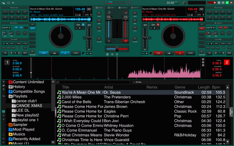 2nd image is config and colors i chose...MY EYES THANK YOU!

 2nd image is config and colors i chose...MY EYES THANK YOU!
Posted Wed 17 Dec 14 @ 9:57 pm
Thank you for your support lucas ^^
Is that 'pause' on startup happening with other skins too ?
(let's say, try with the very default one)
Is that 'pause' on startup happening with other skins too ?
(let's say, try with the very default one)
Posted Thu 18 Dec 14 @ 5:05 am
the default vdj skin? no pause starts up right away... let me see if i can screen capture video it.
Posted Thu 18 Dec 14 @ 7:09 pm


